Newsletter Subscribe
Enter your email address below and subscribe to our newsletter

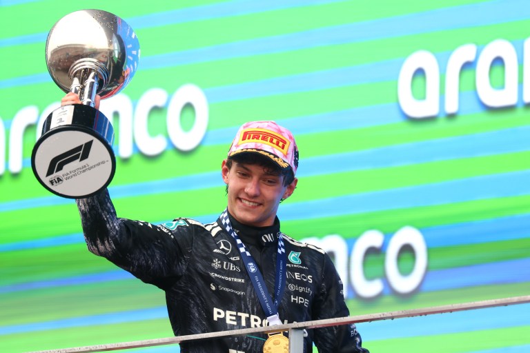
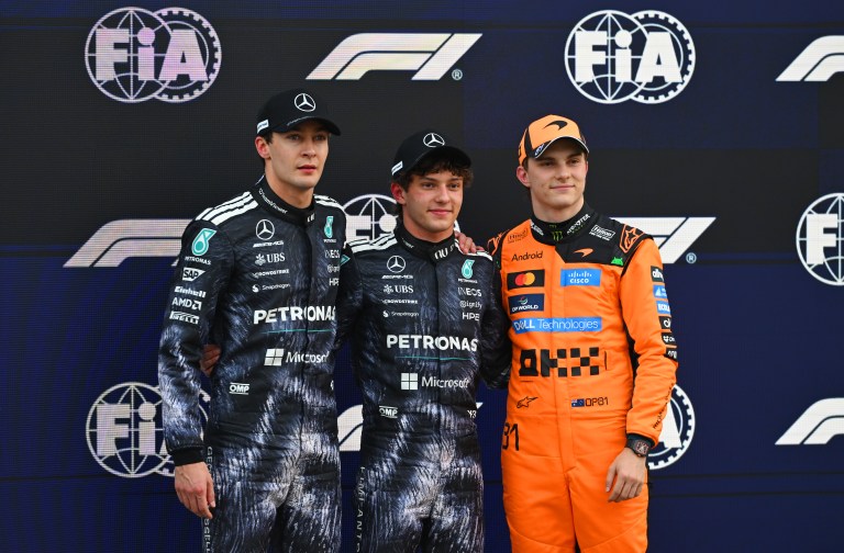
The 2026 Japanese Grand Prix at Suzuka delivered a race that will be argued about in paddock corridors for weeks. Not because of who won (the result was Kimi Antonelli, again) but because of how this race produced that result, and what the position chart reveals about the architecture of competition underneath it.
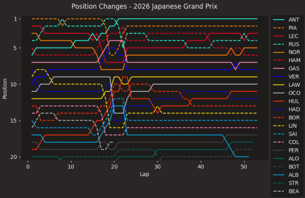
The most striking single movement on this chart belongs to the race winner. Kimi Antonelli, starting from pole, falls from P1 to P6 before Lap 1 is complete. On a position chart, that drop (six places, one lap, on a circuit where overtaking is not straightforward) is a visual shock. It is the moment that nearly cost Mercedes the race before it had properly started.
What makes the chart compelling is what follows that descent. The cyan line does not collapse. It does not stall at the back of the top ten and wait for strategy to rescue it. Instead, it climbs steadily, lap by lap, back toward the front, reaching P4 by around Lap 10 before the pit stop sequence begins. The gradient of that recovery is as important a story as anything else on the chart. Antonelli did not need the Safety Car to be competitive at Suzuka. He would have needed it to win.
The most consequential moment in this chart is not visible as a dramatic crossing of traces. It registers as a sudden vertical jump: Antonelli’s line moving from P3 to P1 in the space of a single lap marker, around Lap 22 to 23. That is the Safety Car window, triggered by Oliver Bearman’s heavy impact at the Spoon Curve (a high speed left hander at the back of Suzuka’s circuit, renowned for its commitment requirement), compressing the field and giving the one driver who had not yet pitted the ability to do so for free.
George Russell’s dashed green line, which had been tracking the front of the race with authority and briefly holding P1 before his own scheduled stop, flatlines in position terms from that moment. He pits just laps before the Safety Car appears, emerges in traffic, and spends the remainder of the race fighting for fourth rather than contesting for the podium. On the chart, that timing gap is a matter of three or four laps of separation. In the championship, it represents a nine point swing.
The contrast between Russell’s trajectory and Antonelli’s (both starting on the front row, both Mercedes cars) is one of the clearest strategic narratives a position chart can produce. Same team. Same weekend. Opposite outcomes from a single moment neither driver controlled.
Oscar Piastri’s orange dashed line tells the most bittersweet story on the chart. It launches from P3 at the start to P1 (a clean jump on Antonelli and Russell off the line) and holds that position for the bulk of the opening stint. For approximately the first 18 laps, Piastri leads this race. His line sits at the top of the graph with authority, and the gap he builds over Russell behind him reads as genuine pace, not track position.
Then he pits on Lap 18. His line drops while the cycle completes. And Bearman crashes four laps later. The chart does not allow you to look away from that sequence. Piastri’s line returns to P2 at the restart and stays there to the flag, 13.7 seconds behind Antonelli. It is a composed, professional performance. But the position chart makes clear that Piastri led this race on merit for longer than anyone who did not win it. That is a different kind of story from second place.
The two Ferrari lines (Charles Leclerc in solid red, Lewis Hamilton in dashed red) spend the majority of this chart between P3 and P6, separated by margins the graph can barely distinguish. The visual proximity of those two traces across the middle portion of the race is the most compressed battle on the chart.
Hamilton benefits from the Safety Car timing, jumping from P6 to P4 at the restart without changing his position relative to the pit stop cycle. Leclerc, already ahead, sits in P3. The chart then records a slow, sustained tightening between them. By Lap 42, Leclerc’s line crosses above Hamilton’s. The Monegasque uses the activation of his Overtake mode (a power boost system available under the 2026 regulations, deployable for tactical passing manoeuvres) to clear his teammate into Turn 1. Hamilton falls to fifth almost immediately after, with Russell and Norris both arriving to further complicate his afternoon.
Leclerc holds P3 to the flag, though Russell briefly forces his way ahead in the final laps before Leclerc responds around the outside of Turn 1. That exchange (two line crossings in the span of a handful of laps) is the last significant movement at the front of this chart. It ends as it began: Leclerc ahead.
Max Verstappen’s solid blue trace begins from P11, a consequence of a Q2 elimination that the chart cannot explain but records without sympathy. The Red Bull line climbs initially, reaching the edge of the top ten in the opening phase of the race. Then it settles. It holds around P8 to P9 for the final two thirds of the race with a flatness that, on a chart where most lines are active and dynamic, reads as damning.
This is not the Verstappen of Melbourne, where his line cut through the field with purpose. At Suzuka, the four time champion finishes eighth. The position chart does not speculate about tyre degradation or pace differentials or aerodynamic balance. It simply shows a line that had nowhere further to go after a certain point, and stopped going anywhere. After three races, that picture is becoming familiar. Verstappen has not finished on the podium yet in 2026.
Oliver Bearman’s dashed dark line disappears at Lap 22, abruptly, with no tapering or gradual fade. It is the cleanest possible representation of a retirement caused by impact rather than mechanical failure. The line is there, tracking somewhere in the lower midfield, and then it is not. The Haas youngster walked away from the barrier at Spoon with a knee contusion. His race ends in two data points: a position, and then nothing.
Lance Stroll’s line tells a similar story, ending before the midpoint of the race with a suspected water pressure issue. Two cars gone before Lap 40. The chart records their exits with the same indifference it applies to everything else.
At the far end of the finishing order, Fernando Alonso’s teal line (tracking near the bottom for the entirety of 53 laps, a lap down on Antonelli) represents a different kind of quiet persistence. Aston Martin finished a race for the first time in 2026. Alonso crossed the line in P18. The chart gives that result no more or less prominence than any other. But after two races that ended in mechanical failure, a flat line at the bottom of the graph, completed, is its own form of progress.
The Suzuka chart is noisier than Shanghai’s. Its top section moves more, its midfield crossings are more frequent, and the single decisive event at Lap 22 is written across every trace that runs to the right of it. Antonelli wins for the second consecutive race and leads the Drivers’ Championship, the youngest driver in history to do so. But this chart does not make that victory look inevitable. It makes it look fortunate in its timing and then authoritative in its execution, which is a precise and honest description of what happened at Suzuka. The position chart does not editorialize. It simply remembers.
Thumbnail: By courtesy of Pirelli